Color is one of the most powerful tools in interior design. Beyond aesthetics, it has the ability to shape how we feel, influence energy levels, and create specific atmospheres in a space. By choosing the right palette, you can design rooms that inspire relaxation, focus, or creativity.
1. The Psychology of Colors
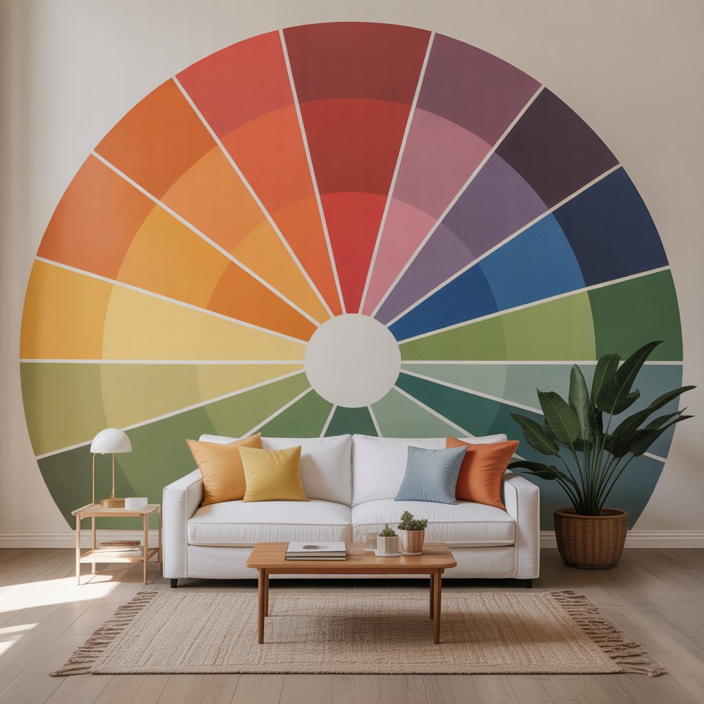
Each color carries emotional and psychological associations:
- Blue: Calm, peaceful, great for bedrooms and bathrooms.
- Green: Refreshing, natural, and balanced—perfect for living rooms or offices.
- Yellow: Energizing and cheerful, ideal for kitchens and dining areas.
- Red: Bold, passionate, and stimulating, best used in accents rather than large surfaces.
- Neutral tones (white, beige, gray): Versatile, timeless, and calming.
2. Warm vs. Cool Colors
- Warm colors (red, orange, yellow) create cozy, inviting spaces but can feel overwhelming if overused.
- Cool colors (blue, green, violet) make rooms feel open and soothing, perfect for relaxation.
Balancing warm and cool tones ensures harmony in your design.
3. Choosing Colors by Room
- Living Room: Neutrals with pops of warm tones for comfort and sociability.
- Bedroom: Cool shades like blue or soft green to encourage rest.
- Kitchen: Yellows and light neutrals to boost energy.
- Home Office: Green for balance or blue for concentration.
4. The Role of Neutrals
Neutrals act as the foundation of a color scheme:
- White walls make spaces feel larger.
- Gray offers sophistication and versatility.
- Beige creates warmth without overwhelming.
They work best when combined with colorful accents.
5. Accent Colors for Personality
Accent colors can dramatically change a room without repainting everything:
- Throw pillows, rugs, and curtains.
- Art pieces or decorative objects.
- A single feature wall in a bold color.
6. Lighting and Color Perception
Lighting plays a huge role in how colors are perceived:
- Natural light enhances true color tones.
- Warm artificial light makes colors appear softer.
- Cool artificial light sharpens blues and grays but may dull warmer shades.
7. Tips for Experimenting Safely
- Start with small accessories before committing to paint.
- Use sample swatches on your walls to see how colors look at different times of day.
- Stick to a three-color rule: a main color, a secondary shade, and an accent.
Final Thoughts
Colors are more than decoration—they’re mood shapers. By understanding the psychology of colors and applying them strategically, you can create rooms that not only look beautiful but also make you feel exactly the way you want.